HowPow Super Cool PICTURES
Friday, January 14, 2011
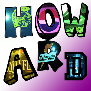
Color stencil #2
Description: I did this project with MICHAEL DESIMONE. THIS IS OFFICIALLY MY LAST PROJECT....EVER.... in this class at least. Michael and I might come back next year, but ONLY if Mrs. Burnette is the teacher. this project was fairly easy. it didn't take that long. The level of majesticness-es in this picture was reached because of the combined force of Michael Desimone and Howard Huang. I actually don't know if that sentence made sense or not. BUT ANYWAY. We used the letter "W" over and over again. The gradient background was done in less than a minute. That's how good we are. anyway, ADIOS AMIGOS!!!!!!!!!!!!!!!!!!!
Tuesday, January 4, 2011
Self-promo Ad
Description: This is by far one of my most favorite projects. I loved working on this, It took me exactly one day to do it. I got all of my fonts off of dafont.com. I did not like the font selection that Photoshop had. My name is in HUGE letters, I changed the color of each letter from light to dark from right to left. It made the name look a lot cooler than just leaving all the letters a single color. I had "graphic designer" and my contact info in grey so my name would pop out. the reason why "Howard" is cyan is because that is my favorite color. The reason why "Huang" is yellow is because huang means yellow in chinese. I selected my favorite pictures to be placed on the ad. To the left is the largest of the pictures, it is a picture that tells the story of how God created the earth. If you ask me, it looks awesome. The other 4 pictures to the right are projects that I had to work on. The left picture was a fun project that I did on my own free will.
Arcimboldo face Fruit
Description: This project is definitely one of my favorite projects ever. It was very fun and creative, it allowed me to do whatever I wanted. I like projects that do not limit me with a lot of rules and requirements. My fruit man is supposed to look like a jamaican man at the beach. I had A LOT of layers in this picture. I mainly used fruit, I do not know if a pumpkin is a fruit or a vegetable... or both... I used things like watermelon for shades and grapes for hair. This project took about 2 classes to do, getting the fruit to be in the perfect shape was the hardest part.
Product Ad
Description: This was a very fun project to work on. I decided to copy apple's style for the ad while also making it original and different. Apple tends to make their ads very simple. They do not have a party going on in the background, they have a simple white background. I decided to use their idea of keeping things simple for my ad. However, I kept it original by using a black background. This ad is mocking the Windows phone since it is nothing compared to the iPhone 4. The windows phone is put into a lower opacity. The ad is supposed to make people laugh and not offend anyone, mostly Windows phone users.
Tuesday, December 7, 2010
Color Wheel Stencil
Description: This was a very fun project. I did this project with my majestic partner; Michael DeSimone. We went on a dangerous journey through a far away land. We were daring and bored, so we travelled to the land call Western Albemarle High School. There, we took pictures of logos so we could brag to our friends back in lala land. We took pictures of logos such as nike and pepsi. Then, we took pictures of letter clip arts and we put the logos inside the letters. Then we added a photo filter to the logos. We also added a gradient background, we chose pink and white because white is white and pink is a very masculine color. Indeed, i just said that, so it much be true. We used the random principles of design to arrange our artwork. We decided to not limit ourselves by using an overall theme or a specific principle of design. It worked well, and although it is random, everything in the picture still goes well together. This project took about a day to do. I. Am. Done. Bye
Thursday, November 18, 2010
Avatar 2
Description: This is my second avatar, personally, i like this one better. i put a lot more effort into this one. it took a very long time to find the monocle and the mustache and the hat. it took me 10 minutes to find out the name of the glass, it is called a monocle. This is my alter ego as a london man. I like their accents and the city itself. their customs and the way they do things are different, yet interesting. I enjoyed this project. It was very fun to make and i really like the picture that came out.
Avatar
Description: This was a very simple project that took around 10 minutes to make. i simply took a picture of myself on photo booth and edited it on photoshop. i erased the background of my photo booth picture, leaving only myself. Then i used the warp tool and liquify tool to change my face. i enlarged my eyes and made myself have a half-smile. Then i took images from google and copied them onto my picture. i found a picture of a halo and wings. Then i found a high quality of the sky. The picture seems to blend in well because of all the white. I am wearing a white hat along with a white hoodie. This is my alter ego avatar. It is a picture of an angel, i know, pretty sarcastic.
Subscribe to:
Comments (Atom)


